Publications > Scream City > Scream City Issue #2 > Giving Alvar Aalto to the Kids by Andrew James
Giving Alvar Aalto to the Kids
by Andrew James
by Andrew James
"Hey, teacher, leave those kids alone!" sang Pink Floyd (or to be more precise, the Islington Green School choir). But, hey; who needs an education, anyway? And, more to the point, who can afford one these days?
Luckily, the caring members of the pop establishment are on hand to ensure that our youth aren't thrown onto the streets at the age of sixteen without a cultural lifebelt. Okay, you may not be able to read or write, thanks to ten years of declining standards (© Daily Mail), but relax: it's one of pop's dirty little secrets that while its practitioners like to pretend that it's all about rebellion, most of the regulars in the NME and Smash Hits over the past thirty years or so had a very nice education, thank you.
So why not learn from them? Especially as so many of them are apt to wear their art-school cred (literally) on their sleeves. Yes, you too can fake it at dinner parties with the best of them, without spending years in further education, thanks to this 10-minute guide to 20th century Art History, as taught to us by the good people in the music biz...
"We want to glorify war," declared F.T. Marinetti in his Futurist Manifesto of 1909. "We want to glorify pretty-boy groups with asymmetric haircuts," declared a generation of graphic designers some 70 years later. The Futurists worshiped speed, mechanisation and the modern world, and their artwork reflected these preoccupations.
They also flirted with fascism, supporting Mussolini in the 1930s. Clearly unsuitable source material, then, for a group that had been accused of fascist sympathies in the recent past. Despite this, New Order insisted that Peter Saville use images by Futurist artist Fortunato Depero as the inspiration for the Movement and Everything's Gone Green covers.
In similar vein, Paul Morley came up with the name Zang Tumb Tuum for the record label he started with Trevor Horn; while he claimed the name came from "Trevor's favourite drum sound", in reality he was ripping off some Futurist poetry by Marinetti. ZTT's first signings the Art of Noise, meanwhile, took their name from a pamphlet by fellow futurist Luigi Russolo (do try and keep up).
The Art of Noise, at least, had a sound that approximated what Russolo had in mind when he wrote about his intonarumori (noise machines); Bill Laswell's group Material later released an album called Intonarumori, but filled it with shambling soupy funk, rather than the "combination of the noises of trams, backfiring motors, carriages and bawling crowds" that Russolo had envisaged some 90 years previously.
Vorticism was sometimes considered the British counterpart to Futurism. Edward Wadsworth's Vorticist woodcut 'Dazzle-Ships in Dry Dock' shows a camouflaged ship waiting to set sail; the artist was responsible for many such "dazzle camouflage" patterns painted on ships in the First World War. Peter Saville (yes, him again) would later use such patterns to decorate an OMD album entitled, naturally, Dazzle Ships.
[Incidentally, Saville's appropriation of art history references would conclude with his sleeve for New Order's appropriately-titled 'Thieves Like Us' single, in which he and photographer Trevor Key recreated the painting by proto-surrealist Giorgio De Chirico entitled 'The Evil Genius of a King' for no discernible reason.]
A few years later, the dazzling Holly Johnson walked away from the sturm und drang of Frankie Goes To Hollywood, and recorded Blast, so titled in homage to Wyndham Lewis's short-lived Vorticist magazine of the same name. Blast boasted a suitably Vorticist-inspired cover, though this high-mindedness sat uncomfortably with the egregious sexual metaphors contained therein ('Ridin' the Love Train' being possibly the most low-brow).
As the horrors of the First World War became apparent, artists across Europe sought new ways of expressing their revulsion at a decadent society. Their revulsion would have been multiplied had they realised their ideas were going to be stolen wholesale by the music industry from the mid-70s onwards—and that they wouldn't be entitled to any royalties, goddammit.
Dada has proved a particularly rich source of imagery for plunder by musicians and designers alike. Dadaists Tristan Tzara and Hugo Ball recited absurd poetry in Zurich's Cabaret Voltaire in 1916; sixty years later Richard Kirk, Stephen Mallinder and Chris Watson hijacked the venue's name as their group's moniker.
Marcel Duchamp, Dada's eminence grise, is namechecked constantly by Hacienda designer Ben Kelly, to the extend that the latter's company's logo is a digitised Chocolate Grinder; Ben also aped Duchamp's Fresh Widow of 1920, a miniature window painted blue with leather panels inserted, in his design for Factory's headquarters on Princess Street in Manchester, by including a blue-paned window in the design. Nice.
Green Gartside of Scritti Politti (who was as happy reading Philosophy Now as he was Smash Hits) also paid homage to Duchamp on numerous occasions. His most explicit rip-off — sorry, homage — was on the rear of their Cupid and Psyche 85 album, a carnivorous reworking of Duchamp's 'Genre Allegory: George Washington'. Duchamp's alter-ego, Rrose Selavy, would later provide inspiration for Chicago's Aluminum Group (whose third long player, Pedals, featured a song entitled 'Rrose Selavy's Valise'.)
Meanwhile, the anti-Fascist photomontages of Dada fellow-traveller John Heartfield would later find their way onto the cover of Siouxsie and the Banshee's Mittageisen single, perhaps in atonement for the former Susan Ballion's rather cavalier attitude towards Nazi regalia.
Russian Constructivism has had a similar appeal to sleeve designers and recording artists alike; Alexander Rodchenko's graphics found their way onto Franz Ferdinand covers (and we'll be coming back to Franz Ferdinand when we tackle next term's history module), while his workers' boiler suits were surely the inspiration for Devo's look 60 years on.
Perhaps the best-known homage is Kraftwerk's Man Machine album, the back cover taking its cue from El Lissitzky, while the front cover is a steal from classic Russian poster design of the period. The stripped-down colour palette of red, white and black that Kraftwerk favoured at the time (a nod to a similar aesthetic in much of Lissitzky's work) would later be appropriated by The White Stripes.
Confusingly, one of their albums was entitled De Stijl, the name of a Dutch art movement of the 1920s (the painter Piet Mondrian, and architects J.J.P. Oud and Gerrit Rietveld were among its adherents) that placed no such constraints on use of colour. A celebration of primary colours and straight lines, De Stijl's seminal works include Rietveld's Schroder House and Mondrian's 'Composition With Red, Yellow and Blue'. Luckily, today's strapped-for-time art history students don't have to travel to Utrecht or Amsterdam to see De Stijl masterpieces; instead they can simply gaze at Joan Armatrading leaning on a Gerrit Rietveld 'Zig Zag' chair.
Bauhaus took their name from the German art and design school. However, any other similarities between Pete Murphy's cronies and the steel and glass Dessau institution were purely coincidental, the former's style being closer to German expressionism than the functional aesthetic proposed by Ludwig Mies van der Rohe, Marcel Breuer and Walter Gropius.
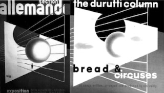
Herbert Bayer, a graphic designer who studied and taught at the Bauhaus, later provided the, ahem, inspiration for the cover of The Durutti Column's 'Circuses and Bread' (or 'Bread & Circuses' if you prefer). Mies's buildings would later become shorthand for cool, appearing on sleeves by artists such as The Aluminum Group.
The pared-down, minimal, functional look of the Bauhaus spread throughout Europe and eventually to America when the school was forced to close by the Nazis, and its tutors and students dispersed throughout the world. Under the catch-all term modernism, the teachings of the Bauhaus would come to define much of the next 40 years, with each country exhibiting its own particular take on the style.
In Scandinavia, Alvar Aalto worked in native woods rather than the chrome, glass and steel of Germany, but displayed a similar design sensibility to his Bauhaus counterparts. This aesthetic caught the eye of Haçienda designer Ben Kelly some 50 years later, when he opted to employ Aalto's signature three-legged stools in the basement bar of the club.
Factory boss Tony Wilson claimed that the Haç was an altrusistic act of enlightenment for Manchester's benighted youth, as much as it was a post-modern gin palace. "We're giving Alvar Aalto to the kids," he proclaimed, magnanimously. Whether the kids actually wanted Alvar Aalto is open to debate; the stools were variously trashed, stolen and used as ashtrays.
Modernist furniture icons have been used by many musicians to add an imprimatur of class to their record sleeves; Antena's 'Camino Del Sol' used an Eero Saarinen table and a Harry Bertoia chair to signify cocktail cool, while even Elton John eschewed his usual rococo style for the sleeve of his album 'The Fox', instead using an Eames chair as a prop.
Sleeve designs aping modernist art movements of the same period, however, are virtually non-existent, though John Squire of The Stone Roses had a good go at imitating abstract expressionist Jackson Pollock on more than one occasion. There are probably many reasons for this; one may be that artists of the more recent past (or, rather, their estates) are more likely to sue. But another may be that, unlike their predecessors of the 20s, 30s and 40s, artists of the 60s and 70s actually started designing record sleeves themselves, and didn't feel that pop music was low art, somehow beneath their rarefied sensibilities.
Pop artists such as Andy Warhol, Peter Blake and Richard Hamilton embraced popular culture and designed sleeves for the Velvet Underground and the Beatles, inadvertently paving the way for Damien Hirst and Jenny Saville to get in on the act with Dave Stewart and Manic Street Preachers, respectively.
The backlash against modernism in the early seventies, kick-started by the dynamiting of the failed Pruitt-Igoe housing project in St. Louis, and the publication of Learning From Las Vegas by Robert Venturi, ushered in the era of post-modernism. Architects and designers, freed from the strictures of modernism, mixed and matched styles with abandon (think Ben Kelly's willful mix of classical columns and arches with industrial elements in the Haçienda); Peter Saville has said that seeing Philip Johnson's AT&T building in New York topped with a broken Chippendale-style pediment was an implicit endorsement of his magpie-like approach to design, borrowing from futurism, surrealism and so forth. Which is roughly where we came in.
So, with the bones of early 20th century art movements having been picked clean of ideas, and the demise of the record sleeve in an age of MP3s, will tomorrow's students be able to pick up the equivalent of an A-level in Art History by scanning the racks at their local Record and Tape Exchange as we've been able to do here? Or will they, God forbid, have to actually apply to a college and study? Parents, hang on to this copy of Scream City and save a fortune.
--
<-- |
Cath Carroll by Mike Stein |
Scream City 2 |
--> |
Issue 2 index
- 1986: The 10th Summer around the Haçienda – goodbye punk, hello hedonism by Gonnie Rietveld
- Consumerism and Its Discontents: The Mis-selling of the Tenth Summer by Steven Hankinson
- The Haçienda Classics by moist
- Andy McCluskey by John Cooper
- The Gig That Drives Me Mad by David Nolan
- A Trip To The Seaside Parts 1 & 2 by John Cooper
- Cath Carroll by Mike Stein
- Giving Alvar Aalto to the Kids by Andrew James