Publications > Scream City > Scream City Issue #5 > Scream City 5 additional material
Scream City 5 was the International Edition with almost every article covering the international operations and artists who featured on Factory Records and its various outposts during the heyday. The graphic identity also had a world theme and the gestation period, like the fanzine itself, was long and complex.
The eventual front, back and inside cover were based on the Dymaxion projection of the surface of the earth as devised by inventor extraordinaire, Buckminster Fuller. However, that was not the original concept.
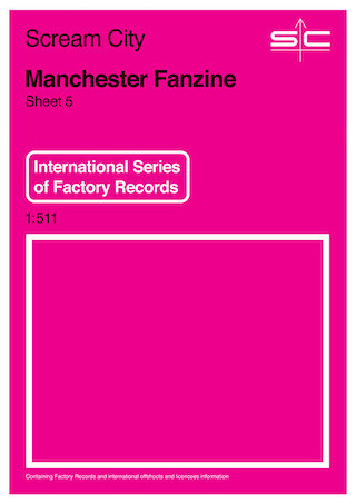
The initial graphic concept was based on another map; a 1970s vintage Ordnance Survey map to be precise. This idea got far as my original black and white mock-up and a more professional colour effort by Steven Hankinson. I eventually went off it because although the map concept supported the geographical content it wasn't international enough. Skip forward a few years and the design did eventually surface, right down the "SC" logo on the Mark Peters 'Innerland' album for Sonic Cathedral but I believe this was down to a design evolution coincidence.
Here's the actual conceptual design brief as I explained to Steven back in 2009:
"FRONT
A "map" called Scream City
Inset on front shows the "coverage" of the map which is a diagrammatic representation of the world with markers for Manchester, New York, Brussels and Australasia (Sydney?).
Other details to include price, an indication of what "series" of maps it is (e.g. equivalent to Landranger or Explorer maps of the Ordnance Survey).
BACK
More map detail with a sample of the "map" itself. This to maybe be an affectionate homage to Trevor Johnson's map covers for ACR. In fact a mountain range a la Force/Bootsy would be good because I am looking to put the little known geographical feature 'Mt. Scary Ice' in there somewhere.
Also to feature a legend to the map sample with each symbol representing elements of the contents of the issue.
In a break from tradition the back cover is not to be reversed.
Steven's reply was: "Maybe you need to sketch it out for me. I'm a bit confused by the description so far. ;-)".
The first sketch was a mock-up based on the generic Dymaxion projection sourced from Wikipedia and some placeholder type indicating the locations of the various international Factory offices.
At this point I also built a paper Dymaxion globe. This was a fascinating exercise and quite revelatory when a single flat piece of paper was eventually turned into a solid.
Further tests followed during which the colour scheme and background textures evolved. I finally on blue, orange and grey with the full extent of the Dymaxion projection extending from back cover, through the front and onto the inside front cover. A further nice-to-do would have been to have a fold-out so that full projection was viewable as a whole. Maybe one day... Regardless, the final issue was printed in full colour bleed on glossy paper and incorporated the most developed design strategy of any of the issues of Scream City.
A final word from Stuart Argabright (who wrote to me after the publication):
John, I was just reading SC5 and wanted to say not only 'thank you' ,but that this is one of the best 'zines' of any kind I have ever come across and read. Top stuff, informative (I think I may have met Mark Reeder) and also so funny (the recounting of interviewing Larry from S25) and I find it amazing to read the M Schamberg interview. And to reconfirm - I did do the hand drawn elements of that poster ! love the um, slightly differing accounts about the IY album cover, Ukranian National Home show as well. Big up yer chest John. Just great ...
---
Footnote: Scream City will return. The long-lost film and video edition of Scream City 6 is going to happen. However, it won't be on paper. The theme very much lends itself to doing it online and I just don't have the time to organise a paper publication this time round. That will have to wait for SC7...
<-- |
Scream City 4 additional material |
Scream City |
~~> |


