Designers > 8vo > Hamish Muir / Bruno Maag - Tephra

Tephra; "AaBbCc0*"

Tephra; "DdEeFf12*"

Tephra; "GgHhIi50*"
Tephra; "JjKkLl100*"

Tephra; "MmNnOo138*"

Tephra; "PpQqRr250*"
Developed with Dalton Maag, Tephra is a font family based on the lower-case typeface designed by 8vo in 1994, for interact, a special issue of the American Center for Design Journal and later used for the 1997 Flux New Music Festival poster series.
Previously unavailable commercially, the original type has been extended and updated to include full upper- and lower-case character sets, numerals, punctuation and European accents. Available in OpenType Format, as a family of six fonts � solid and five related outline versions � Tephra was released by Dalton Maag on 15 January 2008.
Hamish Muir tells Cerysmatic Factory about Tephra:
"Tephra began life as 'Interact' which was designed by 8vo as a screen font for an invited submission to 'Interact' a special issue of 'The American Center for Design Journal' in 1994.
This was later developed by us into a font for print use and was used on a couple of 8vo jobs, including the type in an outline version for the 1997 Flux New Music Festival publicity.
The initial development is fully described in '8vo On the Outside' pp 438-473. 'Interact' was lowercase only + numerals and a limited set of punctuation but no European accents. Bruno Maag made the original fonts from our drawings.
'Interact' was never released commercially or distributed.
I have always been fascinated by geometrically constructed letterforms, and as the original screen-based version of 'Interact' was designed to overcome certain problems with on-screen font rendering, it was natural that one looked to Wim Crouwel's modular letterform designs for inspiration in terms of both process and form, and in particular his 'New Alphabet' and the modular lettering he designed for the 1968 'vormgevers' poster. The original version of interact is in some ways like a much bolder version of the latter.
A couple of years ago I started experimenting with 'outline' versions of the 'interact' print font, carrying on from where I left off with the Flux posters. I wanted to explore the possiblity of developing a series of outline weights of the font which could relate together based on the internal 'design grid' of the letterforms.
The idea was to create a set of related display fonts that could be used together in specific size combinations so that letter size and stroke weights could all 'sit' on an invisible grid underlying the whole page or format. A system for modular, geometric typography, where all the elements are measureable. Why? To limit the range of choice and remove arbitary decision making from the design process. At least that's how I will use it. It's part of the 'job's which design themselves' quest. To find systems and approaches that limit on-the-fly 'push graphics' decision making and more importantly the awkwardness of traditional letterforms when used big on posters. I like the notion of a font that doesn't need letterspacing (as all the characters touch in the solid version) and as well that, as the stroke weights increase in the outline versions, the letterforms merge into each other.
The initial sketches were based on setting 'interact' at 50mm body height and subdividing this into 160 units of 0.3125mm. (The original design grid was 19 units for the construction of the lower case letters + ascenders and descenders, I added one unit for space top and bottom; 20 units in the original design became 160).
Starting with the contour of the letterforms as the 'centre' for the outline the strokes, I tested a range of stroke thicknesses as multiples of the 160 unit grid (see outline_test.eps), the thinnest being 2 grid units (1 either side of the contour 'outline') in 2 unit steps, up to 40 units.
Of these, I chose 5 stroke weights (in addition to the solid version, making 6 variants in total) to develop as full fonts based on the following criteria:
a) 2 units - the minimum possible based on the grid
b) 8 units - the point at which the counters on the lowercase 'e' and 'a' fill in and the dot on the lowercase i touches the x-height
c) 16 units - ratio of stroke to inline = 2:1 and inline = same thickness as stroke in b)
d) 22 units - inline = stroke thickness in a)
e) 40 units - the point at which all the counters fill-in
The next stage was to try and re-set the grid to accommodate the range of outlines I wanted within the same body height at any given font size so that for example,'50mm' 'Interact' would be interchangeable across the six versions that would all share the same central contour but of course the stroke thickness would determine the overall real 'height' for each variant. An after-work chat over a beer with Paulus Dreibholz (who knows a lot more about this stuff than me) revealed I would need to convert my grid to 1000 unit height to work with font design technology.
And that's about as far as I got before I met up with Bruno Maag to discuss the development of the font as a live project.
Bruno took my sketches and the original lowercase of the solid version of the font (which he had digitised 12 years ago) and developed the production versions of the six variants, including the design of the entire upper case letterforms, foreign accents, glyphs and other elements required for a complete OpenType character set. My role in the development phase was to comment on the designs as they were being developed by DM. Along the way, and because of the way font software actually works, it was necessary to make minor stroke thickness adjustments to the first and fourth outline weights to get them to fit 'on grid' in the font design software.
I don't know what other designers will make of Tephra, it will be very interesting to see it in use."
An edited version of this article first appeared in the February 2008 edition of Grafik Magazine to coincide with the font's release.
--
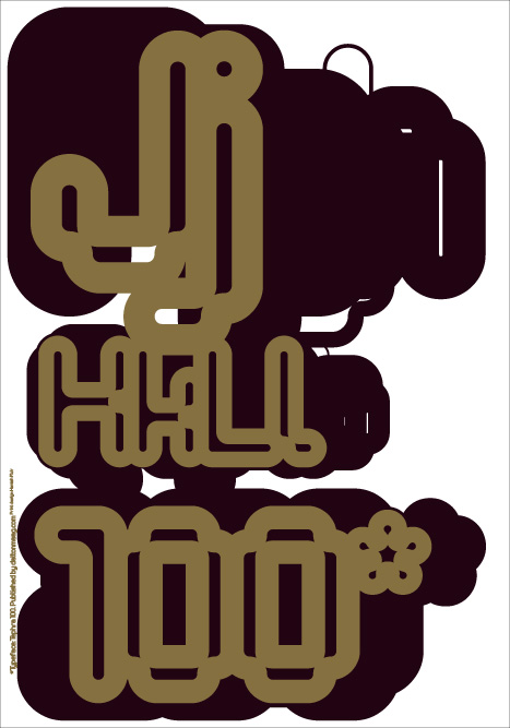
In addition, Hamish has designed visuals using Tephra for a series of six limited edition screen prints (each 100x70 cm) and which are going to be published by Dalton Maag (www.daltonmaag.com) and will be for sale.
Each of the prints has the same base design, with a different metallic colour overprint - one for each of the fonts in the family.
According to Hamish, they are "anti-content, and are only 'specimen sheets'. I didn't want to invent worthy content (like once again, graphic design saves the whale / world / cosmos / by inventing an excuse for another piece of print). They are only about form.
There will also be an exibition of the prints at Leagas Delaney in London. Details to follow on daltonmaag.com, hamishmuir.com and on here.
- -
Thanks to Hamish Muir for info and imagery.