Designers > Peter Saville > Creative Review Jan 2003

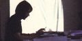
Creative Review; front cover detail featuring annotated artwork for the New Order album Fact 75 Power Corruption and Lies
Creative Review in January 2003 (GBP 5.00 UK) A CENTAUR PUBLICATION featured this major retrospective article looking through the Saville archives as they are prepared for the forthcoming Design Museum exhibition which runs from May to September 2003.
Transcript of the article in Creative Review, January 2003
IMAGINE TRYING TO EDIT A CAREER: laying out the artefacts of your life, the fruits of your labours for over 20 years and attempting to assess what is important and worth keeping, what to leave in and what to cast aside.
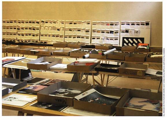
This is the task that Peter Saville has been undertaking for the majority of 2002 as he prepares for the publication of his book, Designed by Peter Saville, and a retrospective of his work at the Design Museum to take place in May 2003 entitled The Peter Saville Show. To aid in this process, the exhibition space of Britannia Row 2, in Clerkenwell, has been generously provided for two months of collation and presentation.
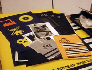
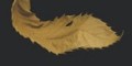
There is an enormous amount of work to sift through: a remarkable working life laid out across decorating tables resembling some kind of art installation. It's all here starting with Saville's work for the legendary record label, Factory, leading right through to identities for Givenchy and sleeve work for Pulp. Each project is housed in a cardboard box: inside is everything from original artwork to the notes and writings that led to the ideas and the invoices, which marked their completion. There are the sheets of metal used for the cover of New Order's Brotherhood, notebooks of lettering by Brett Anderson of the group Suede for the band's Coming Up sleeve, the original leaf shot for New Order's True Faith and the Fantin Latour postcard bought at the National Gallery to use on the same band's Power Corruption and Lies album.
There are a great many people to be satisfied if this project is to be successfully completed, not just publishers and curators but also the great many fans of Saville's work who will be keen to see the components that make up a project, along with seeing rarer examples of work that has defined the graphic language of the last few decades.
Each project is assessed in reference to a number of factors. Is there supporting material? Does it fit into the history of his work? Does he still like it? Without wishing to give away too much about the content of either the retrospective or the book, it is safe to say that whatever passes this stage will not disappoint. Take the Joy Division cover for Unknown Pleasures, for example. Not only are there copies of the release, including the CD card carrying case for your car, but there is also the page out of the Cambridge Encyclopaedia of Science where the illustration was sourced from, along with typed credit notes. There are even sketchbooks containing a plethora of information which provide a key to Saville's thought process, showing the rejections that were made along the journey.
For Saville it is something that he's wanted, and dreamt about doing, for some time. "I have not seen a lot of the work since 1993 when it was packed at Pentagram and went to Los Angeles. In the spring of 1994, Brett Wickens and myself went through a lot of the material, in some empty rooms at Frankfurt Balkind in order to share out portfolio examples". At this time, Wickens, Saville's former partner, had decided to stay in California and Peter was to return to London. "It was a weird experience for both of us."
"Seeing it all again is quite overwhelming. It would be nice just to leave it there, for a year maybe, and I could go and look at it at my own pace. There are some things that are really familiar to me and there are other things I can't even remember doing which is quite surprising. When I do remember it's a nice feeling, rather like finding a box of old diaries or some old birthday cards... something that is not really there in the conscious of your memory but somewhere in the sub conscious. The very act of remembering draws out other things around it."
After this transient stage the next time this work will be seen is in a book and on the walls of a museum. "The physicality of the work from the 1980s is quite evident in the archive. It is quite tangible. Twelve inch covers made out of special paper, posters on unusual materials, invitations using unusual types of printing processes. This material sense in the work is quite pre dominant between 1978 and 1990."
This is something that Saville became aware of around 1989. After a couple of years of screenbased design, his sensibilities about materials, paper and processes had slipped away. The screen had orientated the work exclusively towards the imagery he was dealing with. "We didn't notice it happening. It was only when Brett and I looked back that we realised that we hadn't specially treated anything for a while. Obviously because we were designing on screen. Formerly we had to look at a piece of black and white paste up and use our imagination vis a vis colour and material. Working on screen you would see these things immediately. There is the dynamic of colour and a pseudo dimensionality that you could have never envisaged in your mind's eye staring at a paste-up artwork. Formerly, materiality was in your hands. On screen everything is flat it doesn't exist and can be, in this fantasy flatness, anything you want it to be. It is an end in itself. On screen you make a satisfying piece of work and you can say 'print it'. Paste up alone wasn't satisfying at all."
Pushed as to whether he misses paste up, Saville maintains that this is not at issue. "What I think about now has moved away from any sense of craft, I think that you can see that in the work. A physical presence is missing. Working digitally you need to be aware of that. You have to think about it and realise that if you are seduced by what you see on screen you might be overlooking some other qualities.
"The archive shows that in the first five to ten year period I quite obsessively collected everything we did. I tried to make sure we had examples of everything because the opportunity to do the work was so special. In later years a kind of laissez faire attitude has crept in. This exercise has shown that we do not have examples of everything that we have done. Of course we have examples of record covers but we don't have the promotional CDs, the advertising or any of the tour material. It's just not there."
Saville's greatest disappointment is not having a full set of posters of everything he has done. "The companies are not as forthcoming as they used to be in giving out copies. The whole system operates so quickly now. Usually you find that these things are printed and distributed before you have had time to pick up the phone."
Also Saville has not been as conscientious because much of the work is not regarded as special any more. The work of his earlier period was seen as breaking new ground with material, product and promotion. It was a period of exploring new ways of working. In the latter period, those new ways have been thoroughly absorbed by the system and are now an extension of "marketing" and as such they do not have the same challenging qualities. "At Factory, when we put something in an unusual package it was in order to question the system and challenge people's perceptions of how a piece of music could be presented to the public. In the 1990s if you see unusual, or what is now called 'special' packaging it is a deliberate marketing device, on behalf of the company, to seduce the consumer. It has no genuine counter cultural value. It isn't questioning - it's a marketing ploy.
"The development of imagery has become more important to me. My early work was retrospective, an appropriation and recycling of known visual forms from history: they were used as codes to symbolise an attitude and position something. Creating imagery has become the only way for me to work now, as opposed to retrieving imagery. I have no wish to make new work that is the re creation of an earlier work or period. Since the 90s I have been attempting to create images that could not have existed before, [there has been] a consequent shift in emphasis from materiality to imagery."
As an example of this shift, Saville suggests comparing the sleeve for Suede's Coming Up with that for Joy Division's Closer. "Coming Up is about a moment and a technology now, whereas Closer evokes a former moment, even in the materials used. They are both time capsules."
But can anything be learnt from the former moment? For Saville, presenting communications in forms other than full colour litho print on coated paper is being superseded by a wave of interest in other processes as a counter reaction to the 'finish' of product, the blandness of commodity. "In the places of cult spirit, wherever they exist, the communications can be raw. In fact it feels better like that. I love buying CDs that aren't in jewel cases but the question is 'is it different or just pretending to be?"'
The process of laying out the work has added to the questions and answers that already occupy Peter Saville. "There has been a debate in my mind for years, about what I'm asked to do and its validity. When I look at the archive I recognise the work that was created outside the conventional system, the work that I wanted to do, done the way I wanted to do it. I recognise what was belief and what was business."
"I will be relieved to see the most enduring [pieces] in a book and a show. I have never been able to present an adequate portfolio of my work to explain or present myself to anyone. I have not had a comprehensive way of saying this is what I am and this is what I am about. This has been frustrating. The work needs context. My thinking needs context in order to quantify it. Colour copies in a portfolio do not create context. Seeing the work finally organised chronologically and narratively will be rewarding."
Designed By Peter Saville is to be published by Frieze in May, 2003, £19.95. The Peter Saville Show will be at the Design Museum, Shad Thames, London SE1 from 23 May to 14 September
[end of article]
A selection from the Saville collection